Luisa Saborio is an independent graphic designer and brand specialist based in Madrid. Her work focuses on brand strategy, visual identities, spatial & experiential design, websites, and marketing materials for a range of small independent business and multinational commercial brands.
Grace
Info
Grace
Brand Strategy, Visual Identity, Packaging System
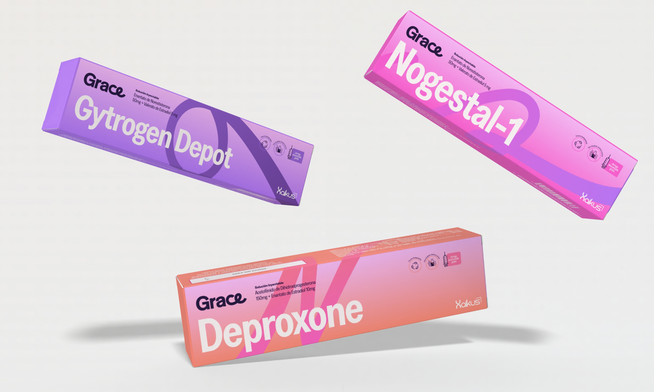
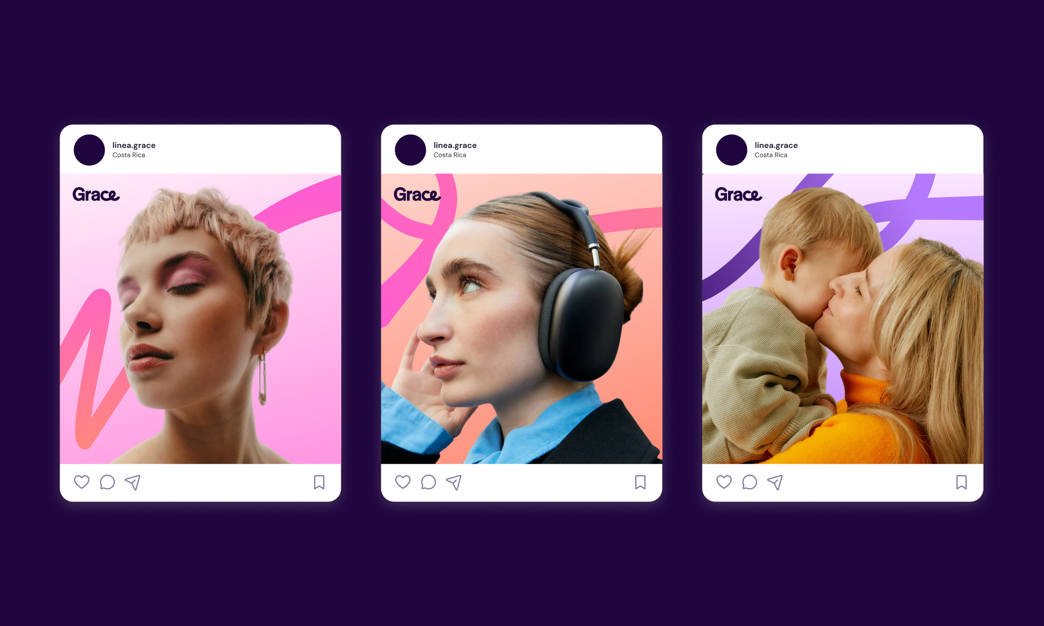
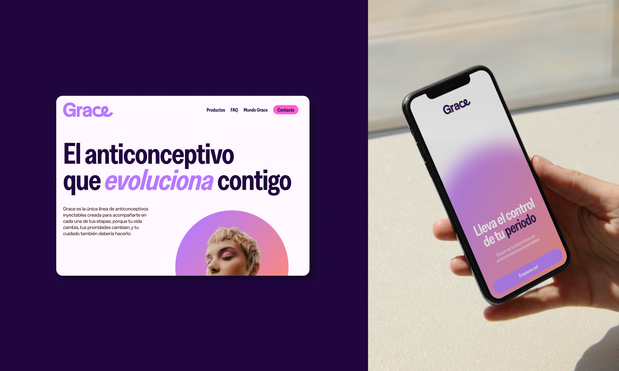
Grace is a contraceptive product line by Calox designed to support women through different life stages with autonomy and ease. As a long-acting injectable method, it offers protection without daily routines, allowing contraception to integrate seamlessly into everyday life.
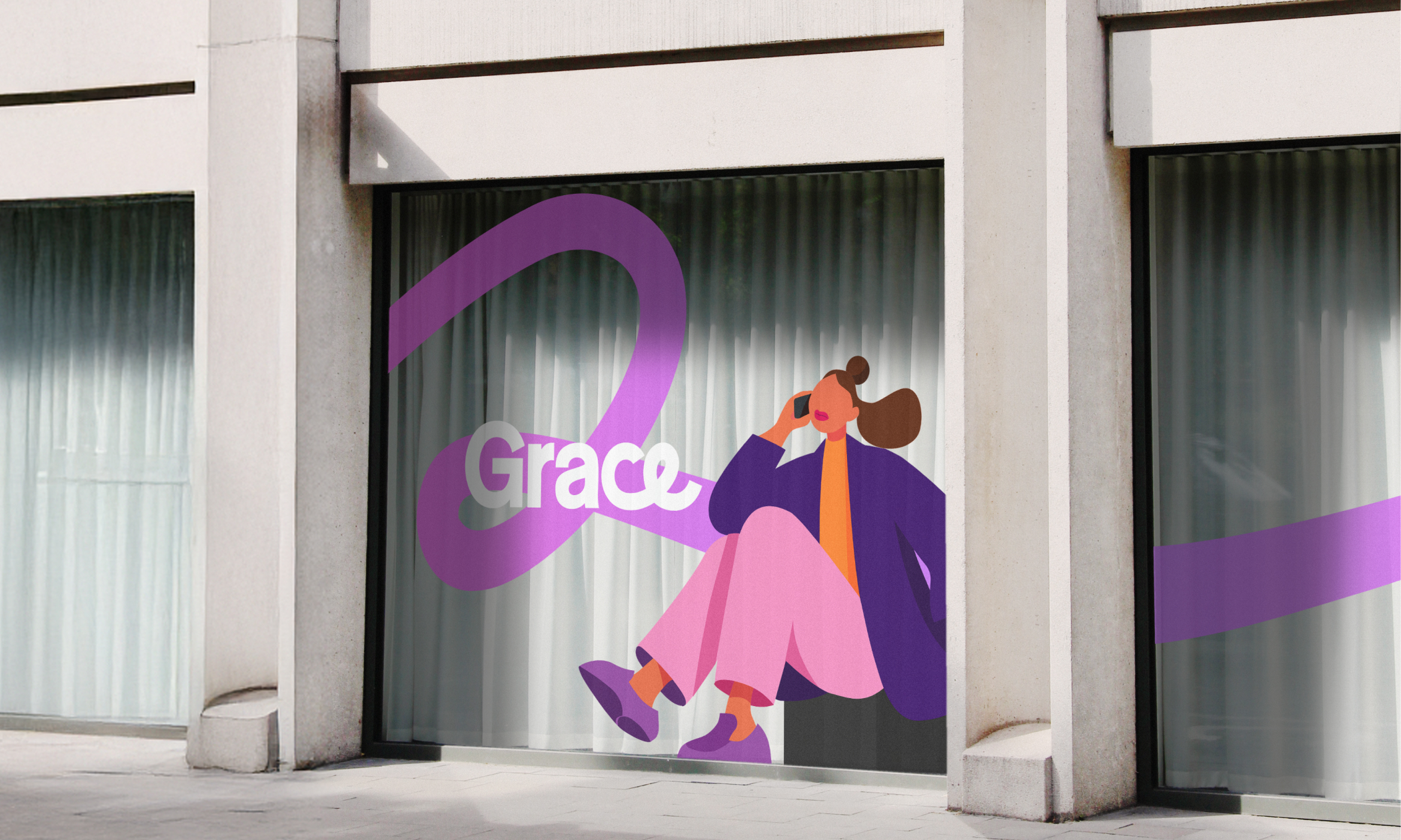
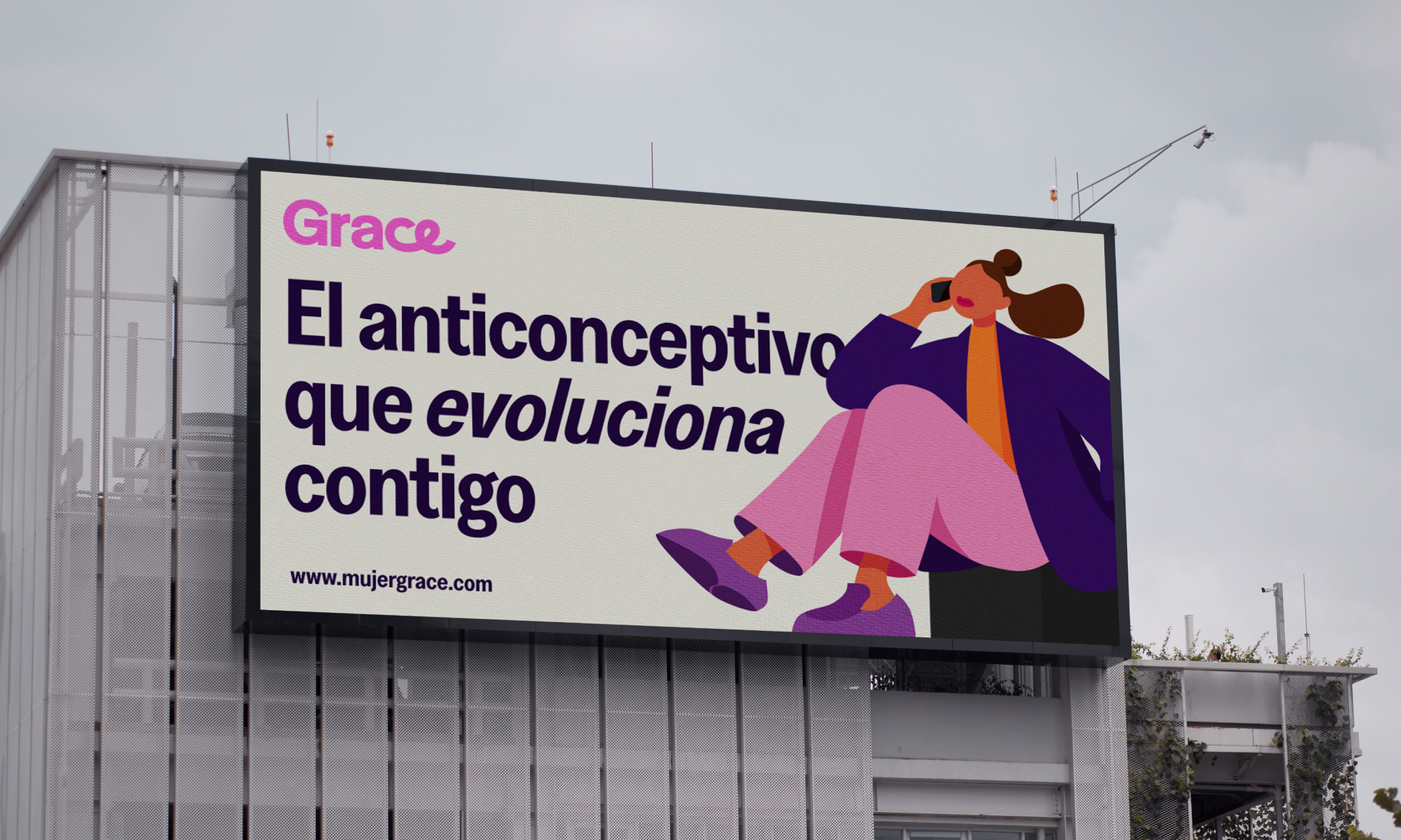
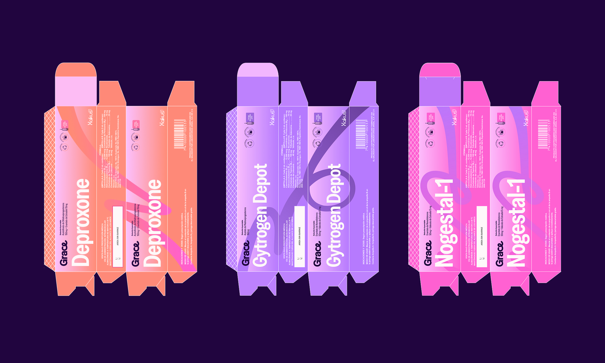
The identity reframes Grace as both a name and an idea. Rather than presenting the products as isolated medical solutions, the brand is built around a single character whose life evolves over time. Each formulation corresponds to a distinct moment—early contraception, long-term protection, and a return-to-fertility option—creating a clear, intuitive system grounded in continuity and choice.
A bold, vibrant visual language challenges traditional taboos around women’s health. Expressive color, confident typography, and illustration-led storytelling give the brand warmth and visibility, while a shared structure across the range ensures clarity and cohesion. Each product claims its own color within the system, allowing the line to expand while maintaining a strong, recognizable identity.
Musa del Sol
Info
Musa del Sol
Brand Strategy, Visual Identity, Art Direction
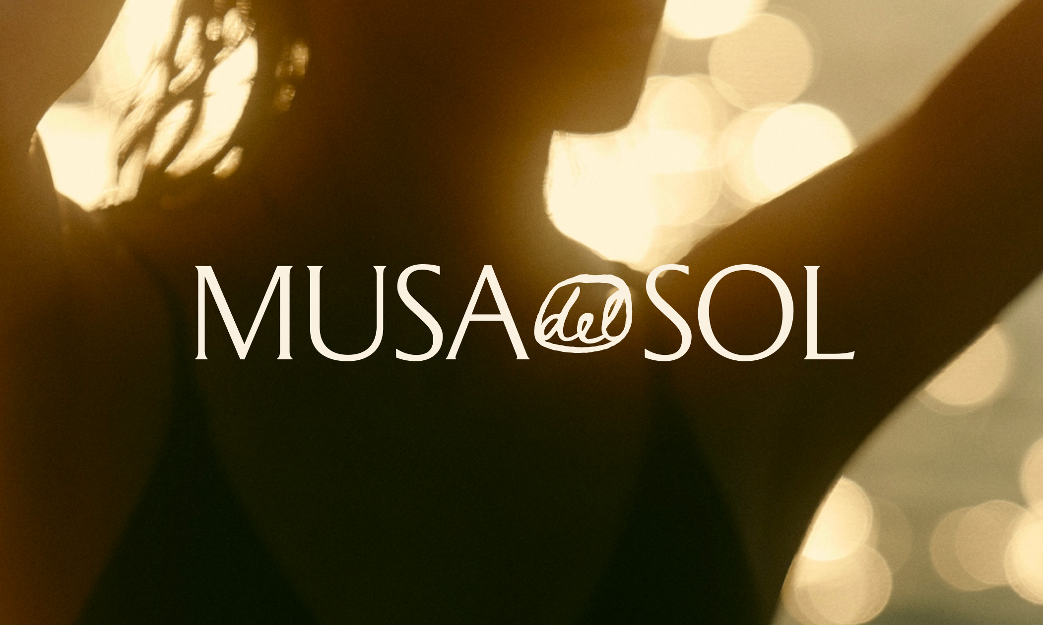
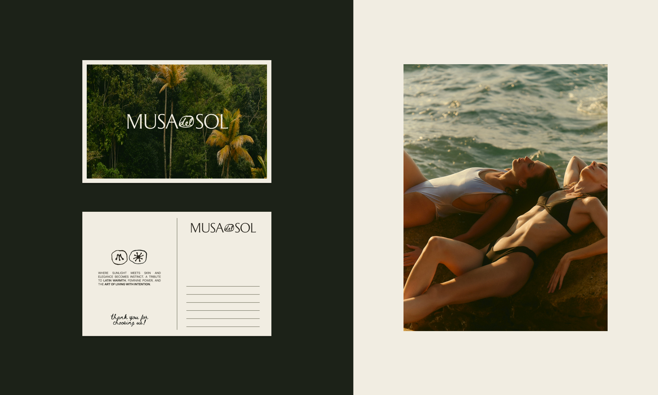
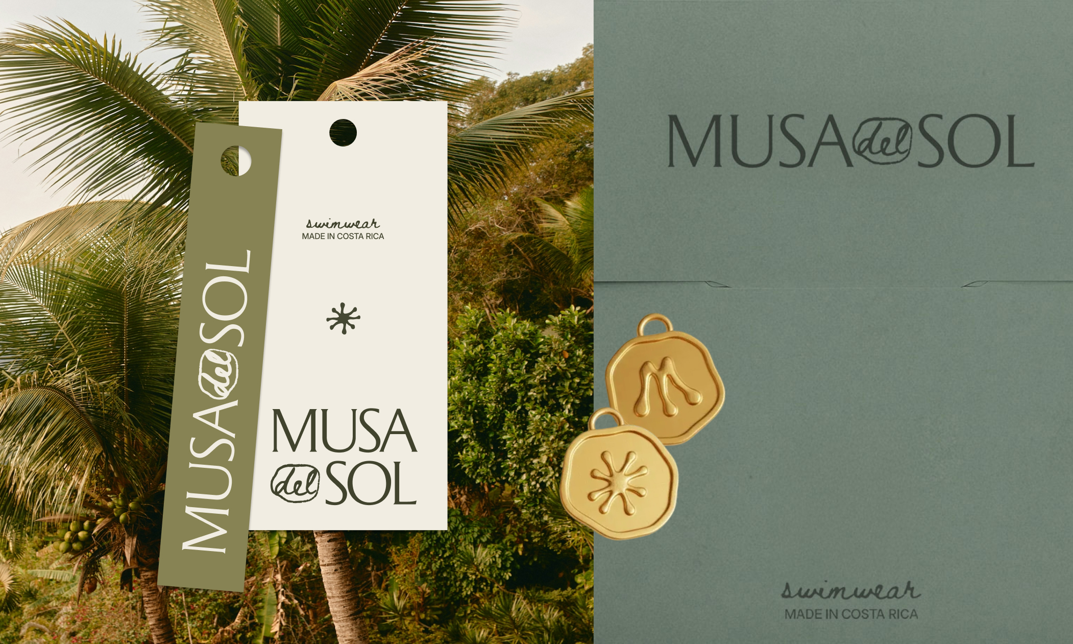
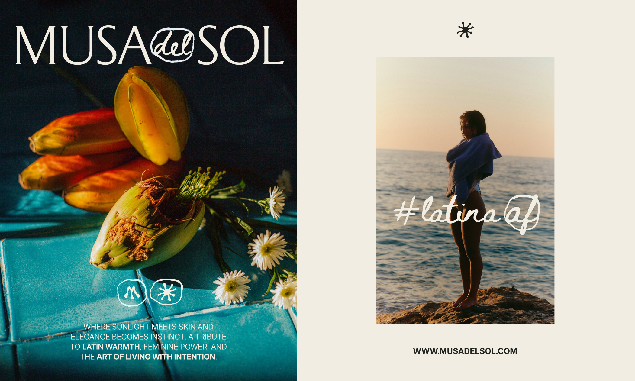
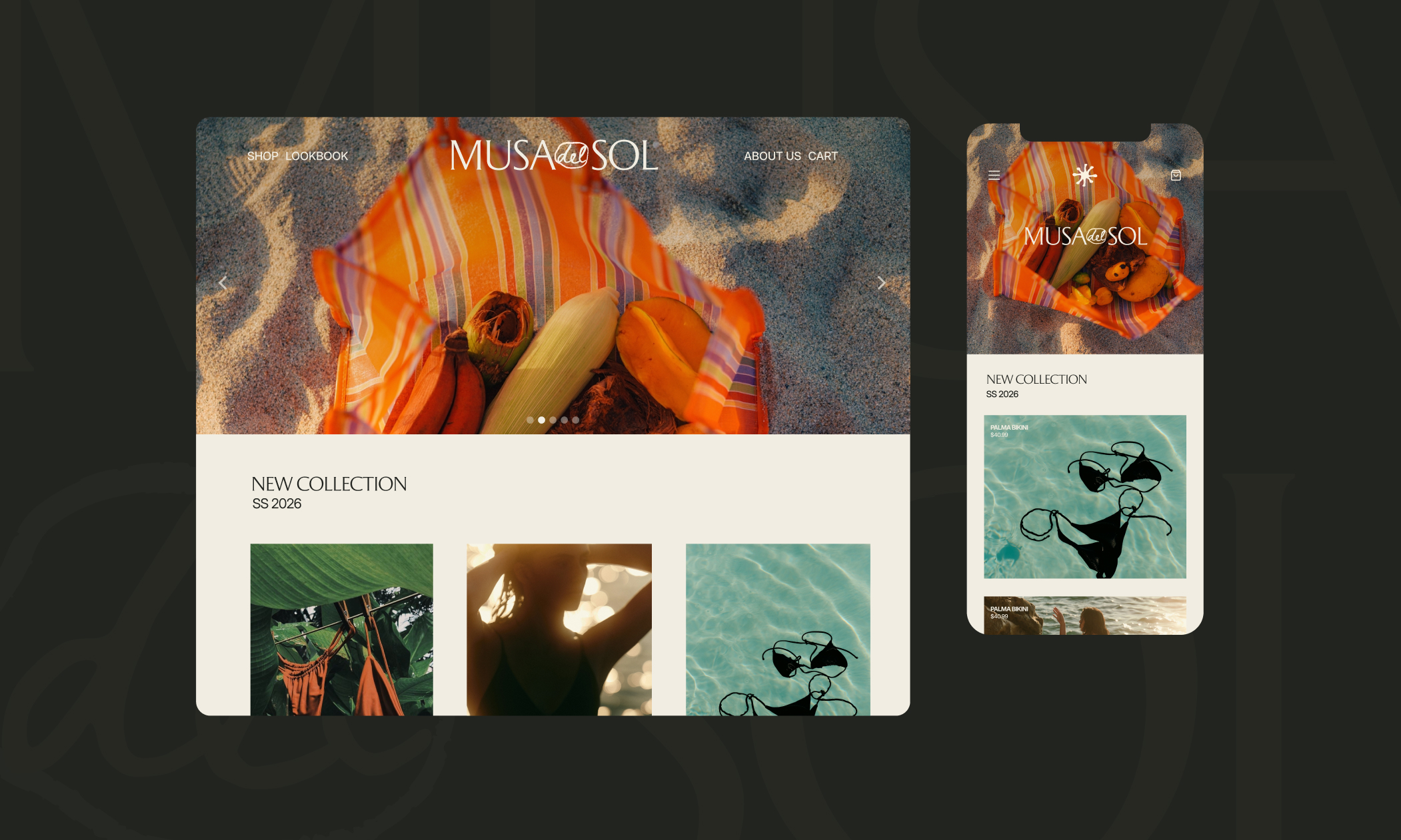
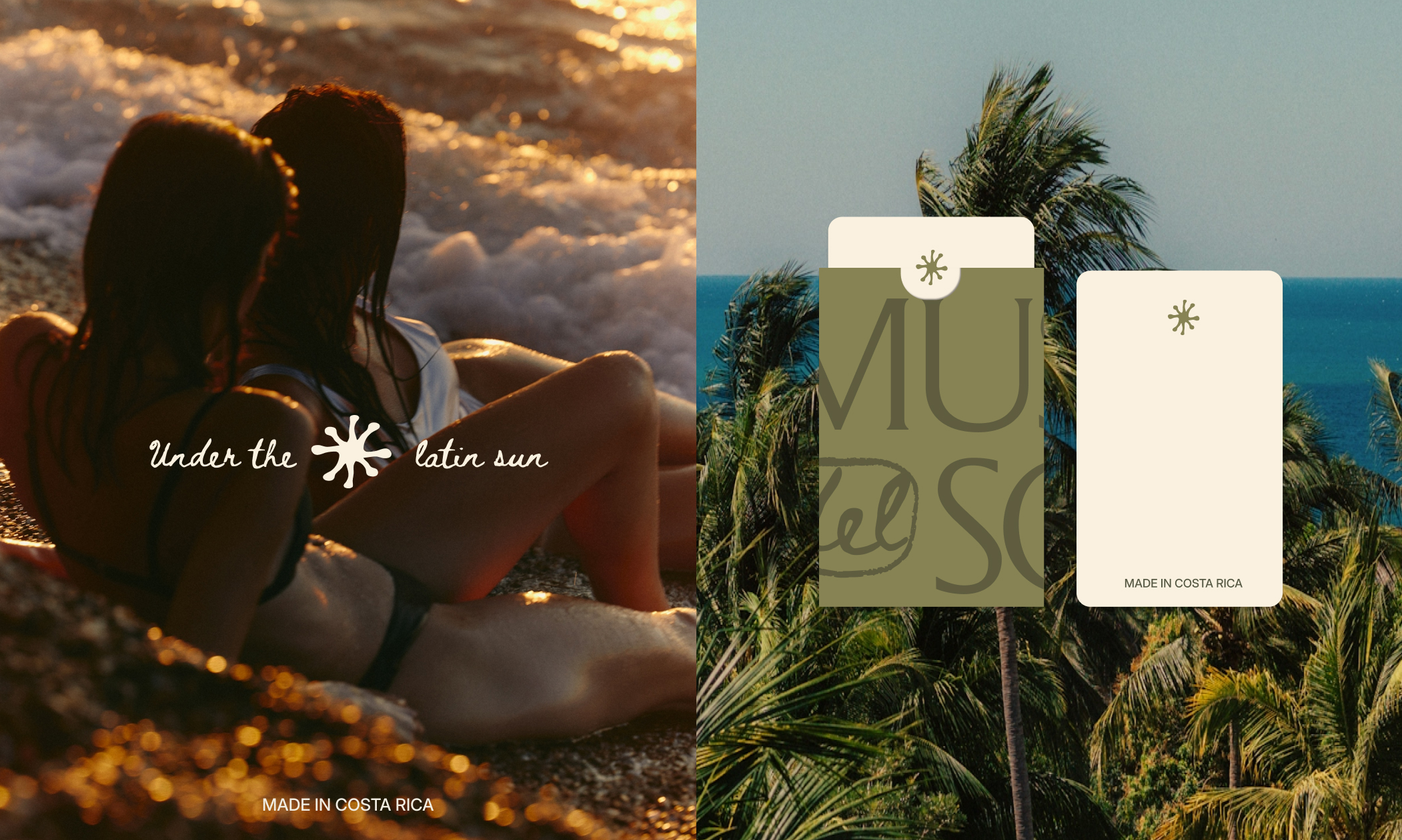
Musa del Sol is a conscious luxury brand born under the Costa Rican sun, celebrating the strength, sophistication, and timeless elegance of the modern Latina woman. The brand blends modern refinement with the warmth, emotion, and authenticity of Latin heritage, creating a presence that feels both global and deeply rooted.
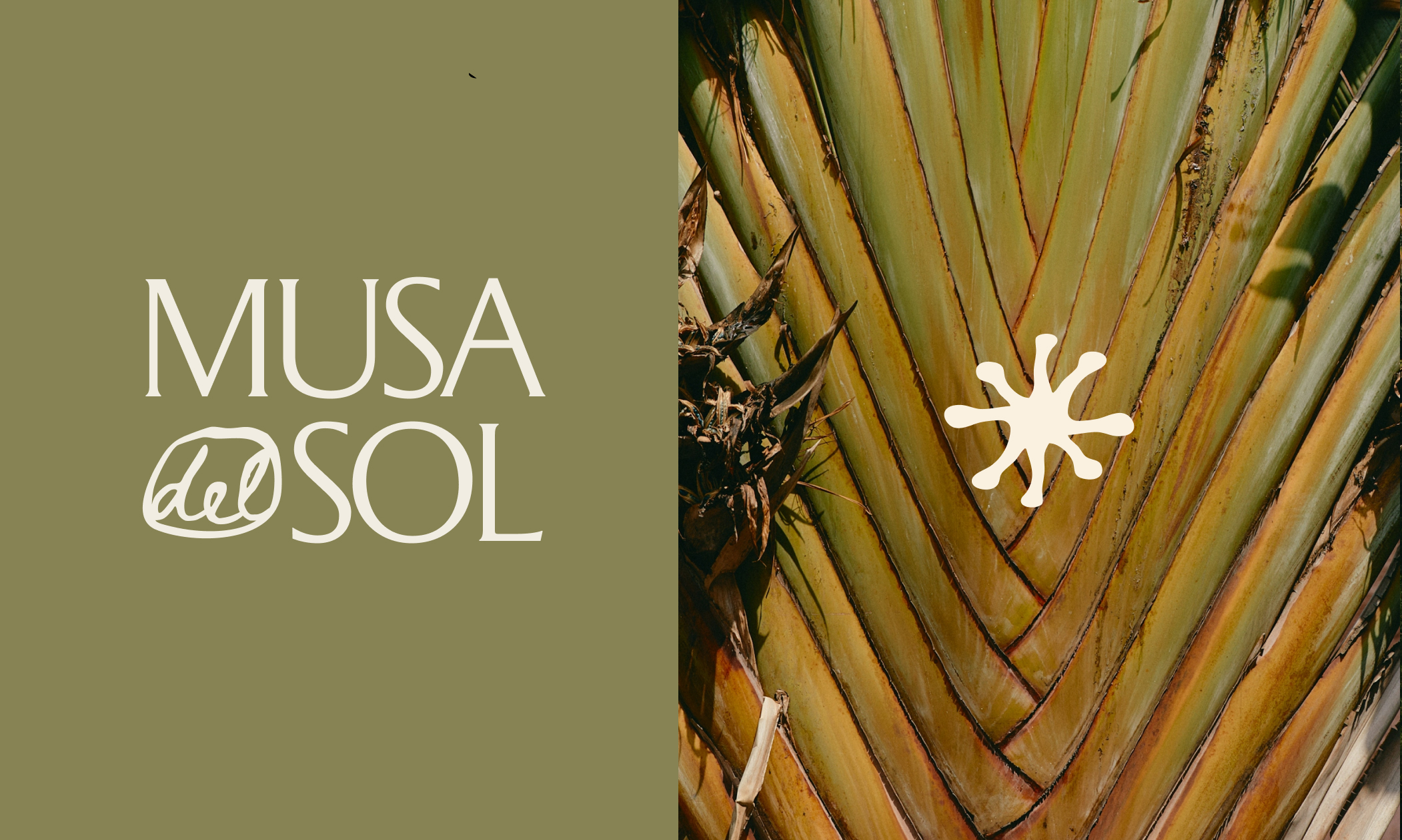
The visual identity is built around a handcrafted medallion shape and an irregular sun symbol inspired by Costa Rica’s unique fauna. As a country that holds 4% of the world’s biodiversity, representing its vibrant landscapes and life was essential to creating a sun that feels truly distinctive, organic, alive, and subtly imperfect. Minimal serif typography adds quiet authority and femininity, balancing simplicity with elevated character.
A palette rooted in Costa Rica’s tropical greens paired with modern whites creates a warm, elevated expression of luxury. The result is a brand that doesn't seek to shout, but to radiate confidence, authenticity, and a distinctly Latin soul.
Waugh Health
Info
Waugh Health
Brand Strategy, Creative Direction, Visual Identity, Motion Graphics, Social Media Strategy
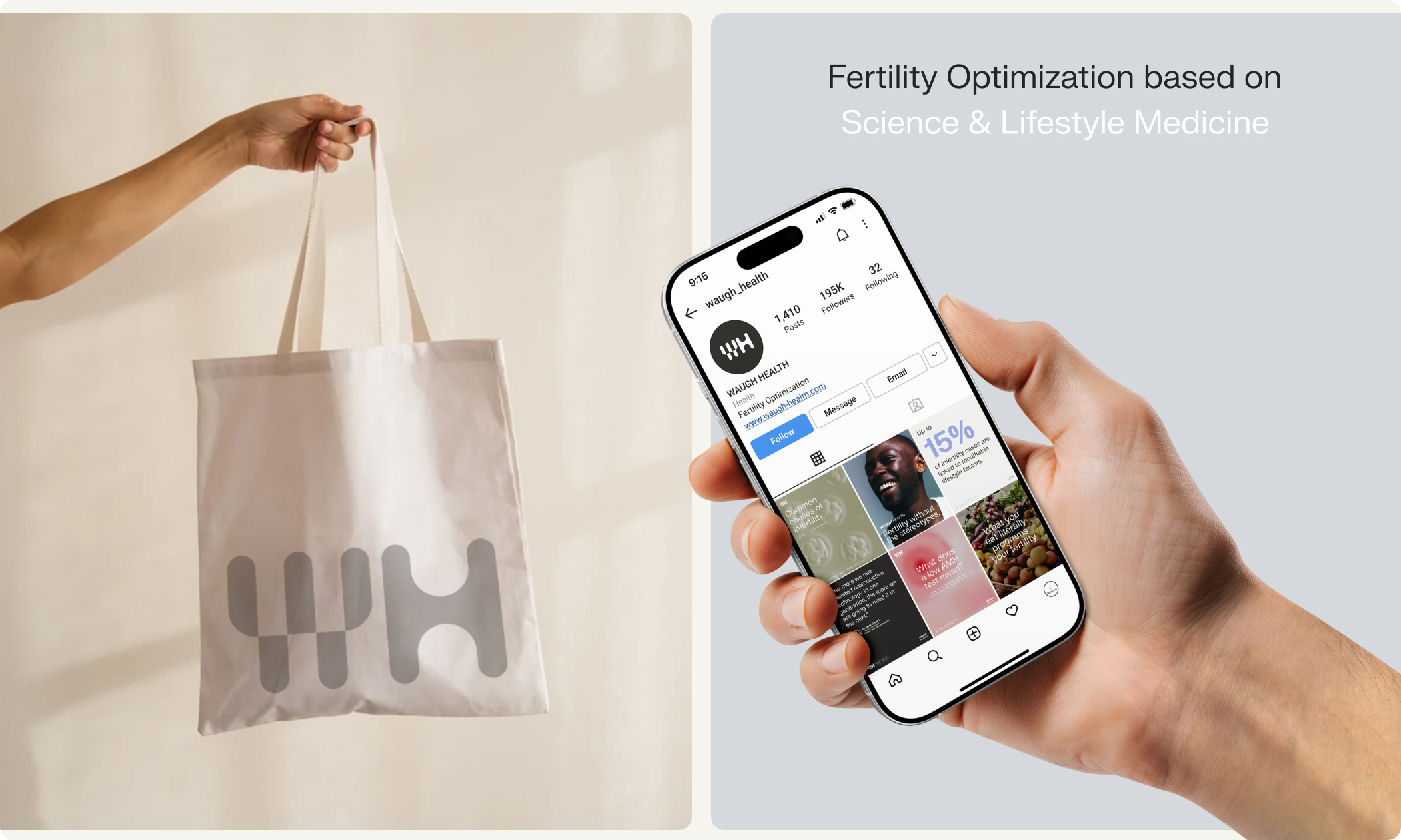
Waugh Health is a fertility platform that blends clinical science with everyday lifestyle practices, making reproductive health clear, practical, and emotionally supportive. Its mission is to empower individuals in Latin America with evidence-based education that is easy to understand and simple to apply in daily life.
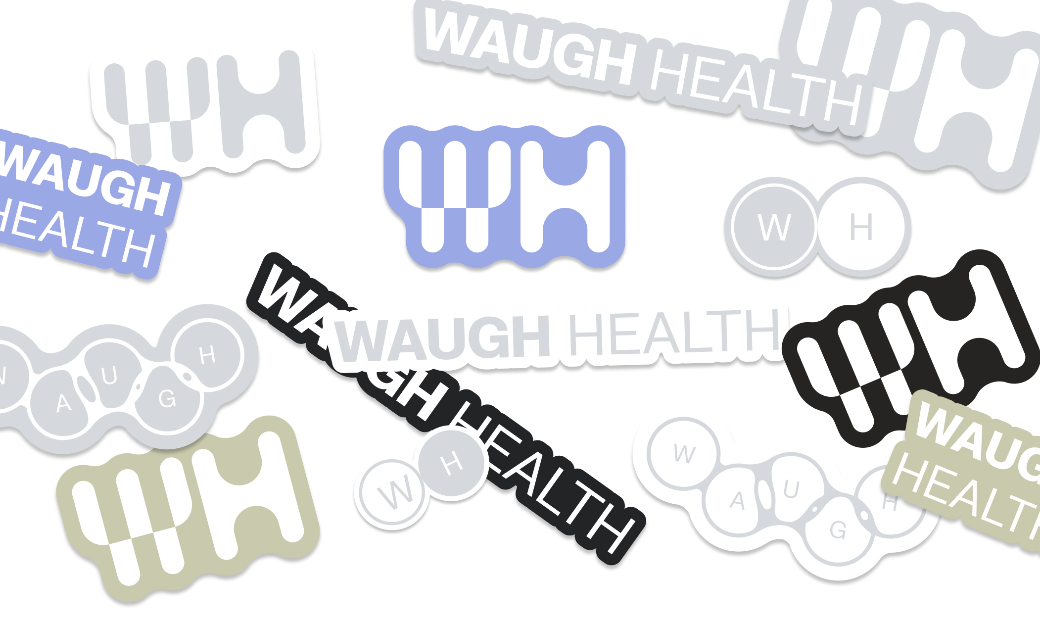
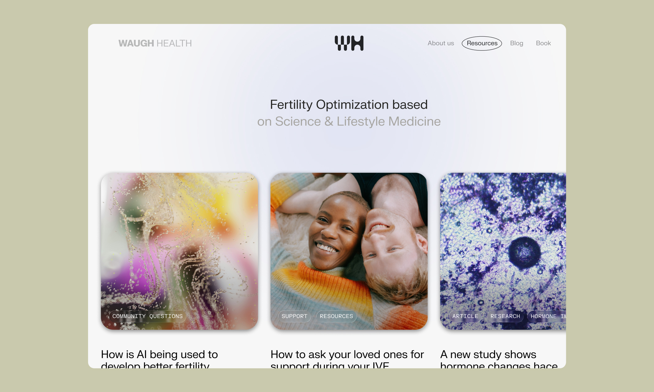
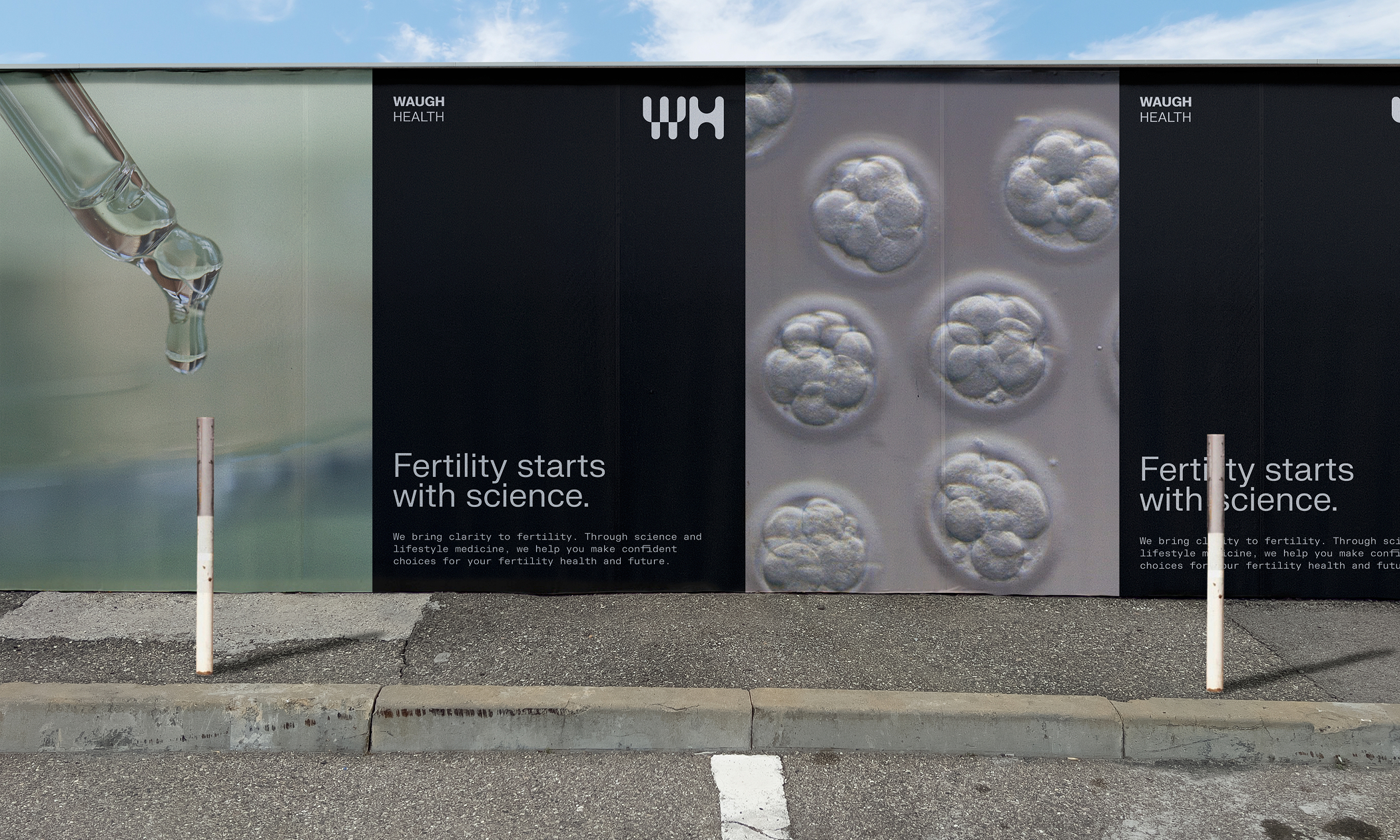
The visual identity expresses science, clarity, and confidence through a clean, minimal system. A bold modern grotesk for WAUGH paired with softer sans-serifs and subtle monospace accents creates a visual language that feels precise yet approachable. Scientific without being cold. The palette combines neutrals, graphite, sage, and a light purple that evokes molecular hues and subtle lab tints, reinforcing a trustworthy, research-led atmosphere.
Inspired by petri dishes, molecule clusters, microscope views, and glass slide labeling, the visual language translates scientific concepts into simple, intuitive cues. Clean grids, generous white space, gentle photography, and microscope-inspired transitions shape an experience that guides users with warmth and clarity—always grounded in evidence.
Zick Studio
Info
Zick Studio
Brand Strategy, Visual Identity, Art Direction
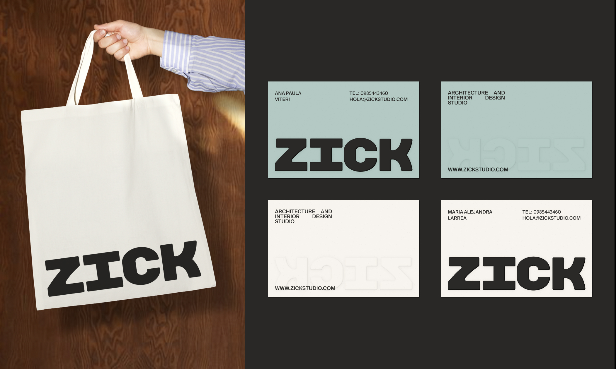
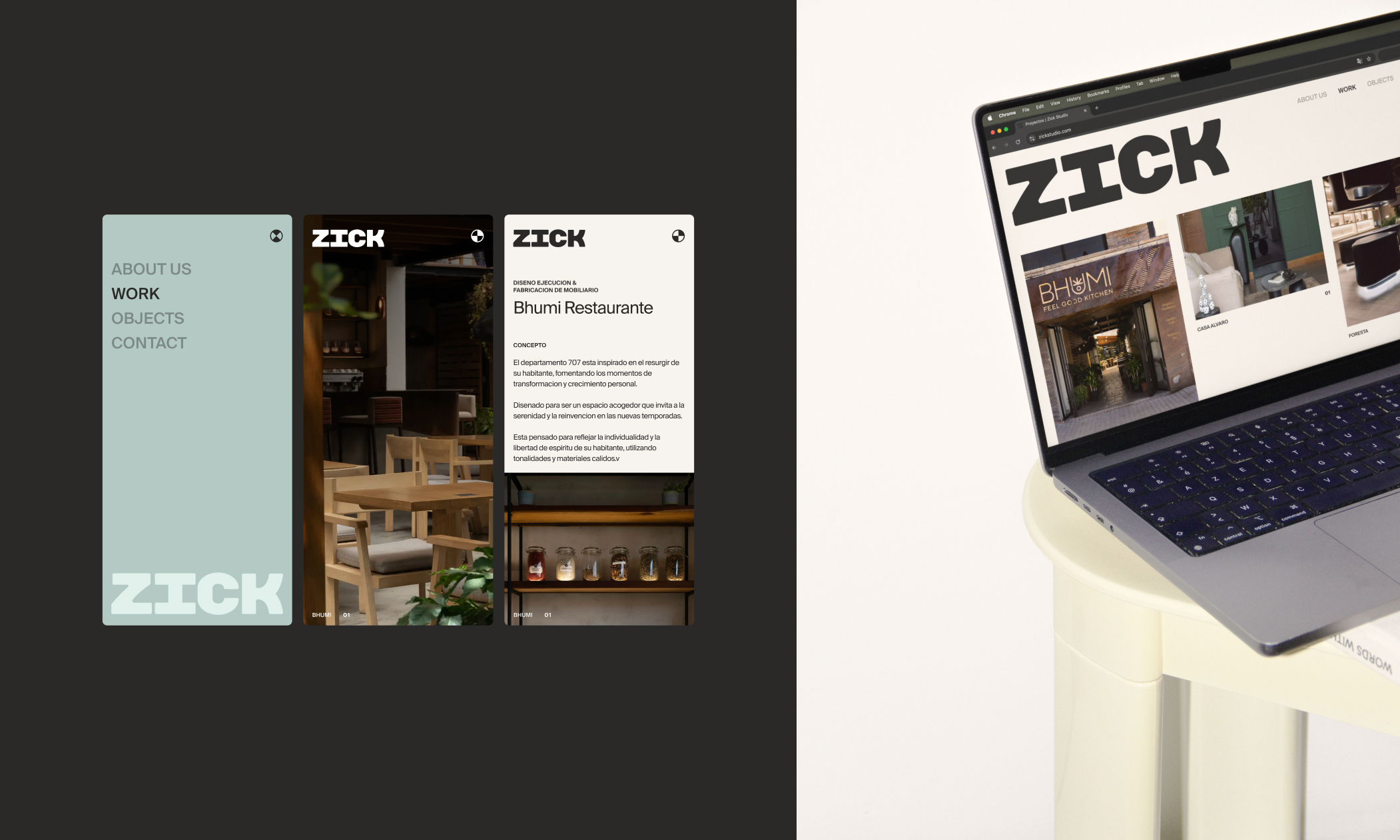
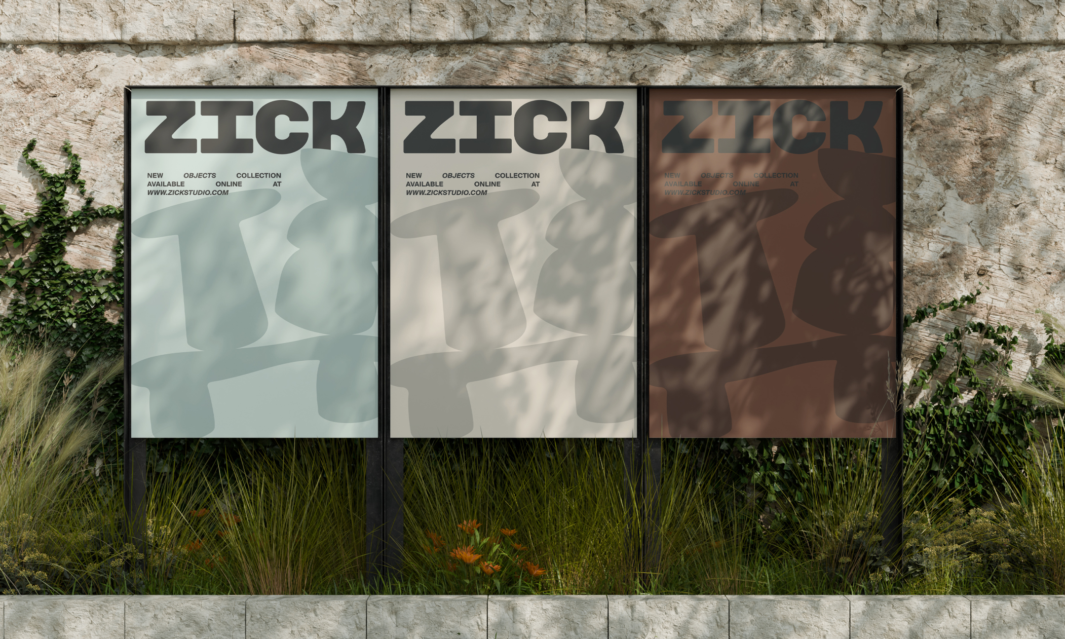
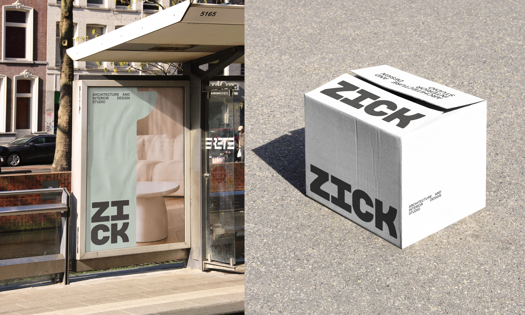
Zick Studio evolves from its playful origins into a refined interior design brand positioned for high-end architectural and development projects. The new identity expresses seriousness, conceptual depth, and an elevated approach rooted in craft, precision, and intention.
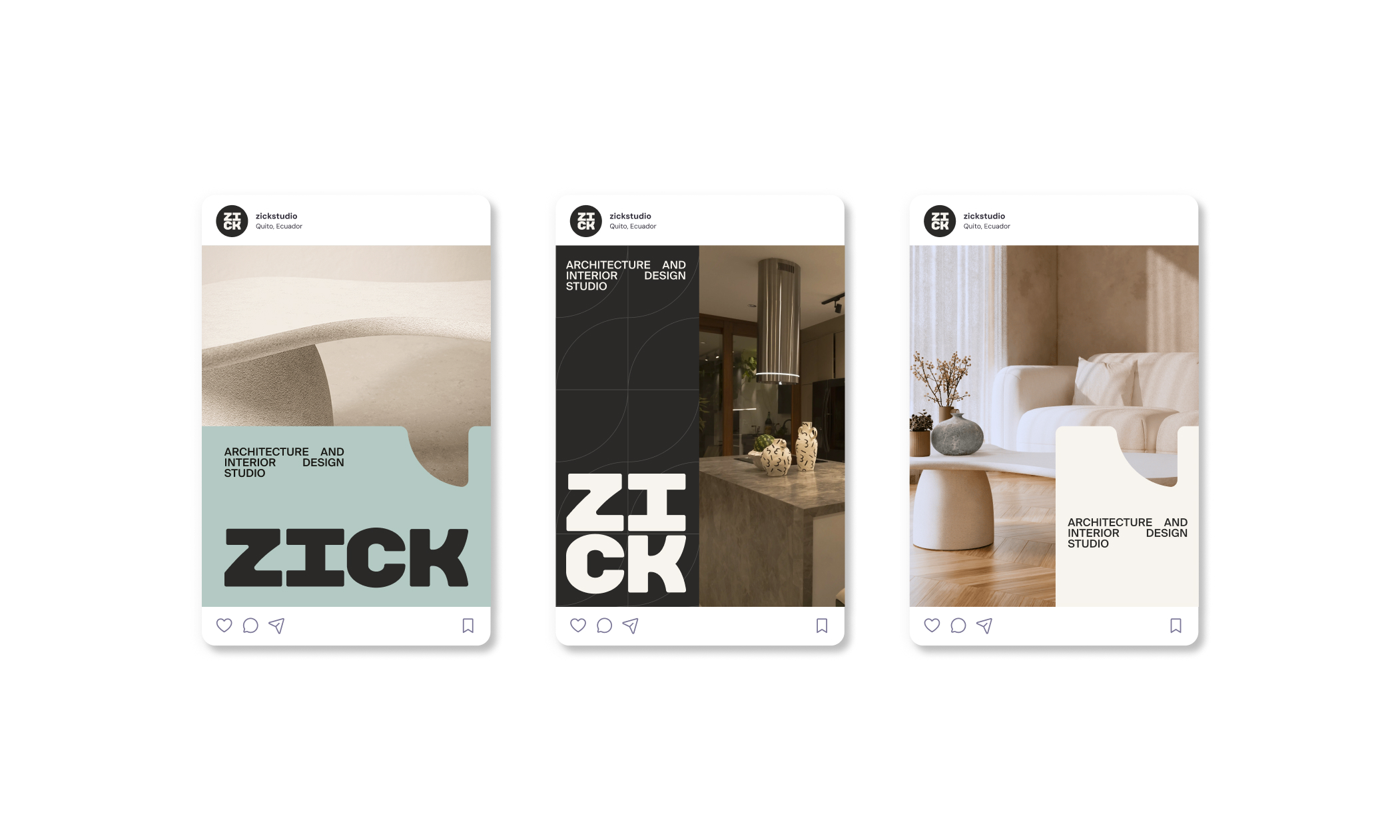
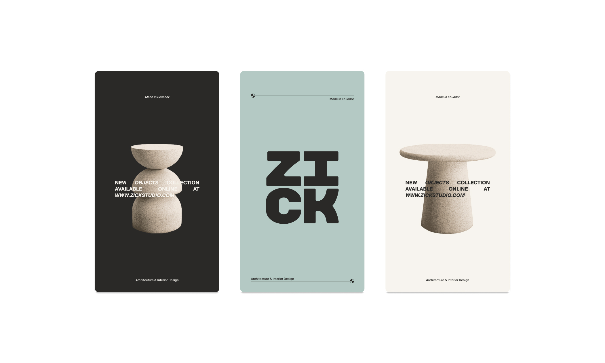
A bold, high-contrast sans serif becomes the central wordmark, paired with a palette of architectural neutrals and sophisticated accents of deep turquoise and terracotta. This balance honors the original identity while redefining it through an earthy, timeless lens. Editorial layouts with generous space and clear typographic hierarchy bring structure, elegance, and a sense of quiet luxury.
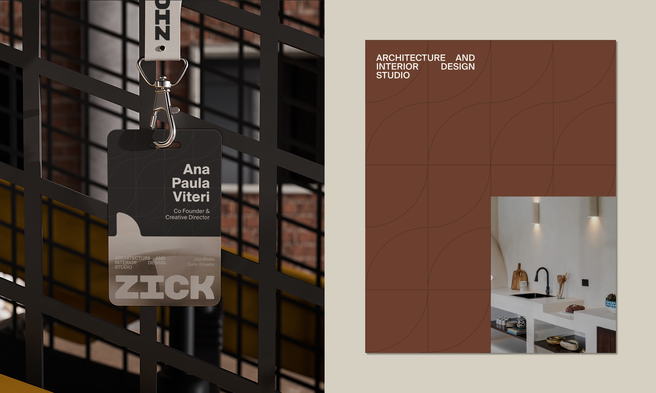
At the core is a reinterpretation of the original Zick module as a “door” symbol—an architectural form that functions as container, pattern, and structural element throughout the system. Combined with warm, textural photography that captures craft, detail, and emotion, the identity communicates spaces that feel thoughtful, elevated, and meticulously designed.
Playtomic
Info
Playtomic
Artworking, Visual Design, Adaptations, Social Assets, Motion Graphics, Video Editing, Infographics, Product Guides, Digital & Print Outputs
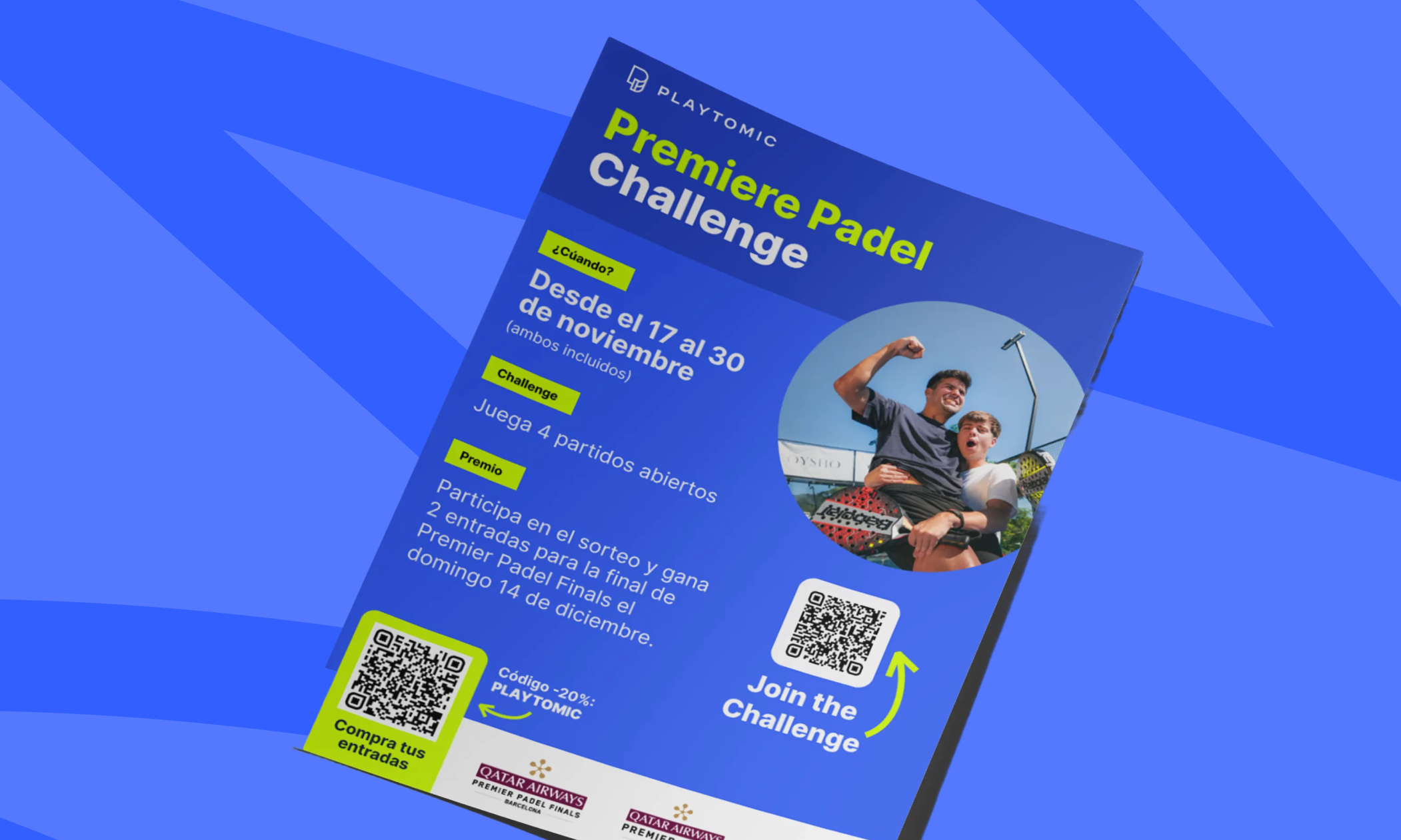
Ongoing freelance support for Playtomic, keeping their brand consistent across global markets while designing and adapting assets for digital and print. The work spans social posts, product guides, infographics, and motion/video pieces; all produced with clarity, precision, and brand alignment.
From translating videos and layouts into multiple languages to preparing clean, ready-to-use files for different formats, the focus is on making Playtomic’s content scalable and easy for teams to implement. The result: smoother workflows, faster execution, and a visual system that stays strong across regions without losing personality.
Real de Minas
Info
Real de Minas
Brand Strategy, Visual Identity, Motion Graphics, Signage
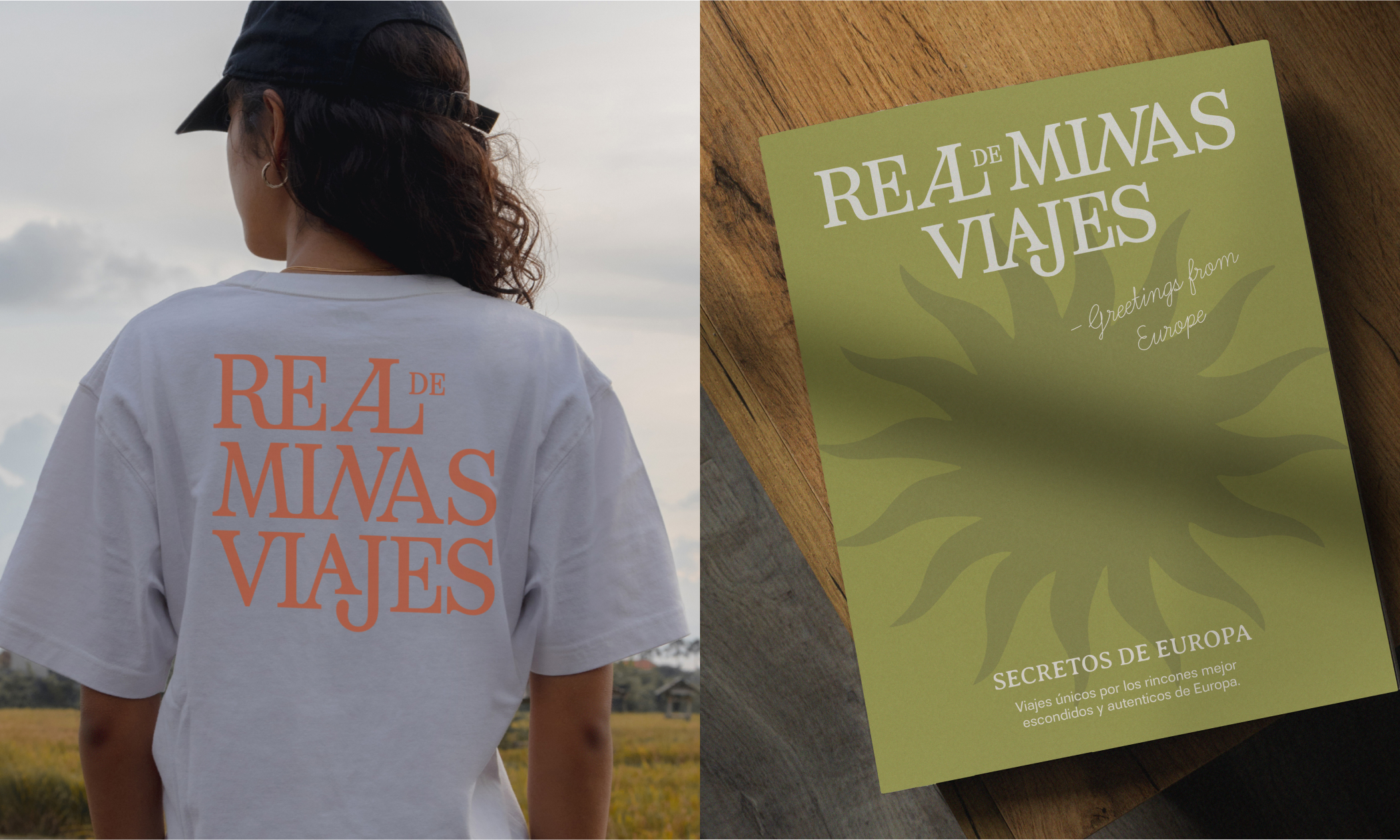
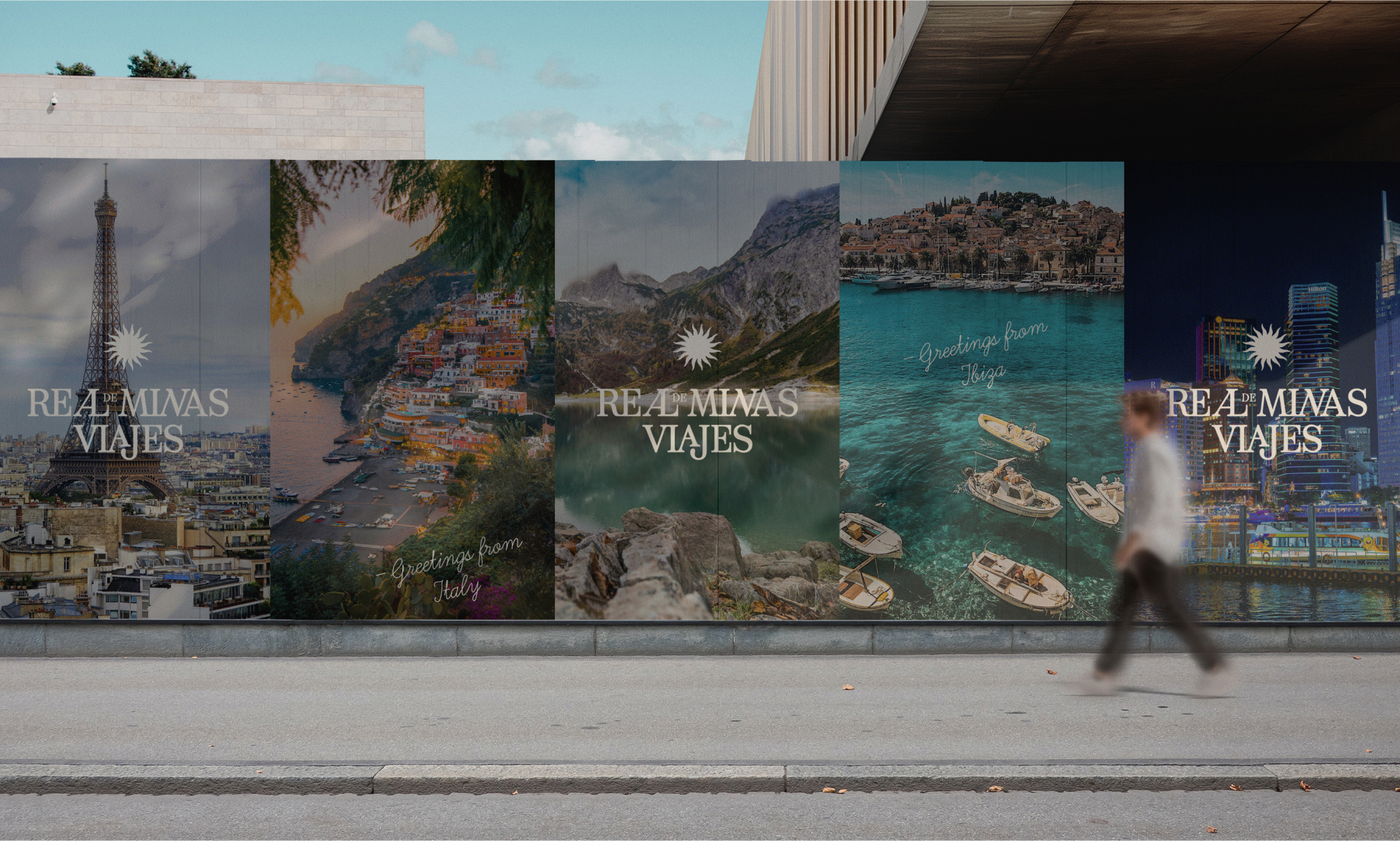
Rebranding for Real de Minas Viajes, a luxury travel agency in Mexico specializing in creating unique and personalized experiences. The original style of the logo was reinterpreted in a modernized version without loosing the source of origin for its shapes.
The aim was to blend the rich cultural heritage of Mexico with a contemporary luxury aesthetic, appealing to discerning travelers seeking authentic, transformative experiences.
The logo draws inspiration from traditional Mexican design elements, reimagined with a modern twist. The use of custom serif typography is an appreciation to classic Spanish signage, while the vertical layout and iconic sun symbol create a distinctive and memorable brand mark.
Docaboca
Info
Docaboca
Branding, User Research, Creative Direction, Copywriting, Visual Identity,Packaging Design
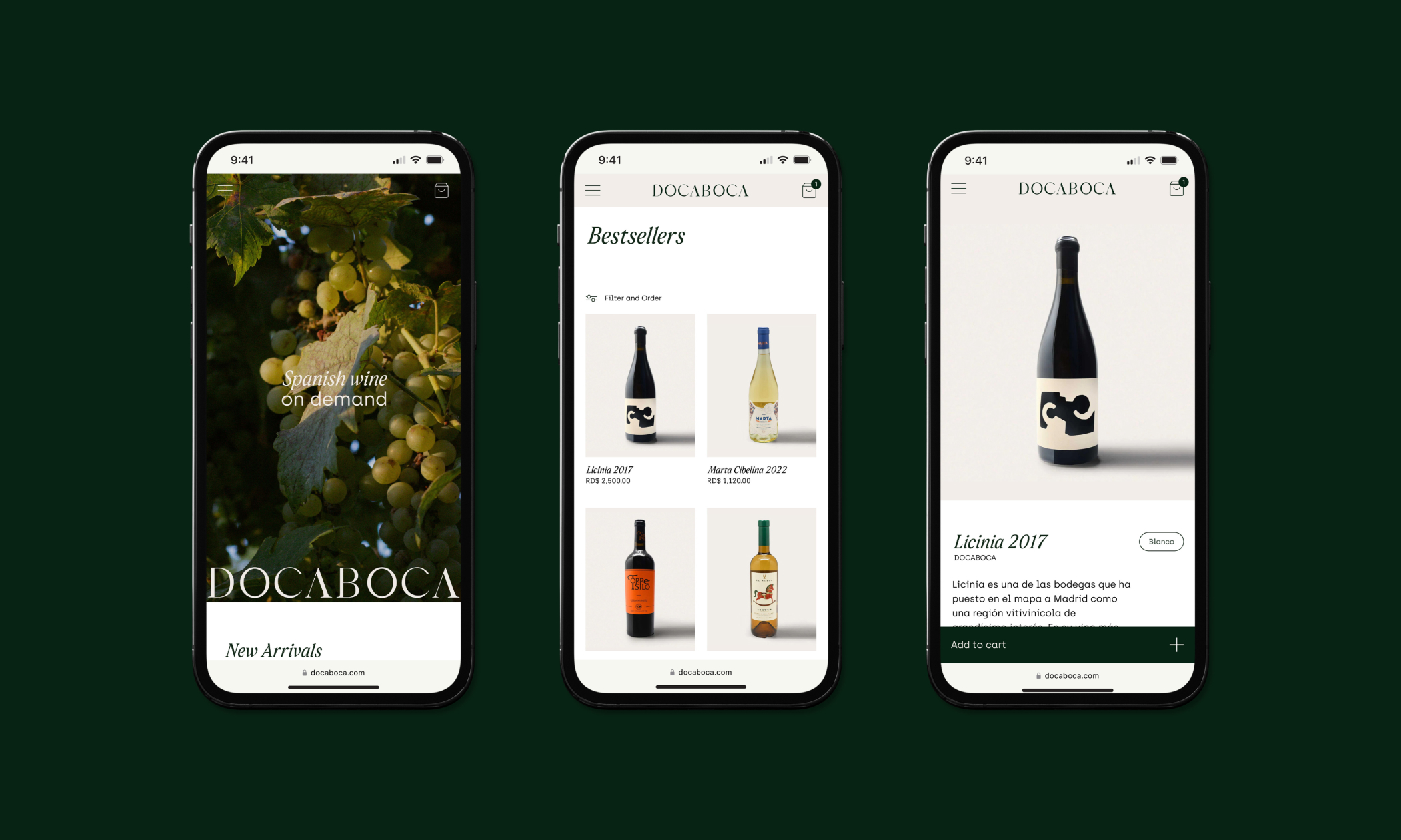
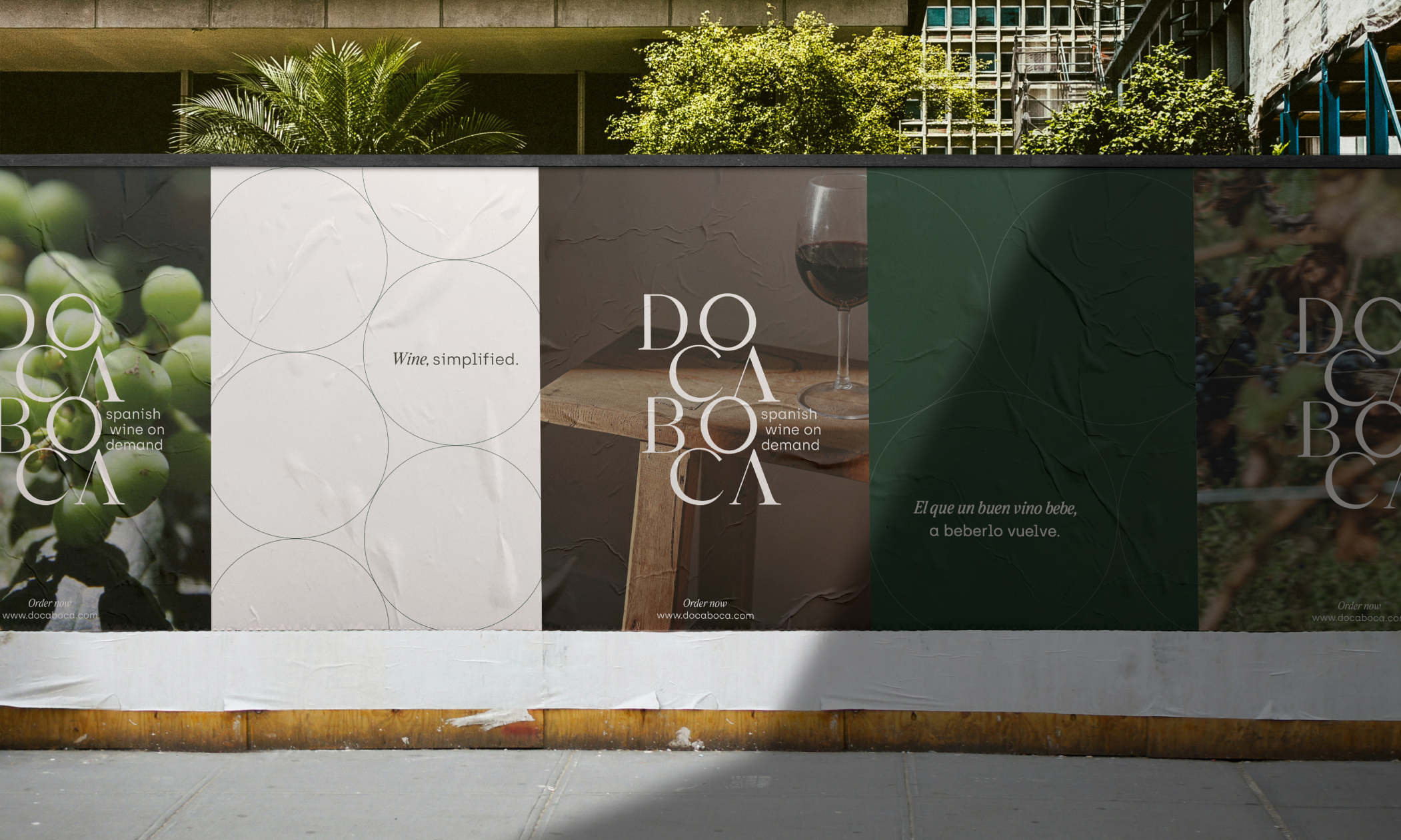
Branding for Docaboca, an e-commerce platform in the Dominican Republic selling Spanish wine. The aim was to balance the branding between traditions of the product, but attribute modernity to the overall feel of the platform to attract a younger audience to what would usually appeal to an older demographic.
The logo was inspired by the repetitive theme of circle compositions in the wine industry, like the barrels, the grapes, and the glasses. Small details, like the use of Spanish-made typography, keep it unique and true to its essence.
New Standard
Info
New Standard
Brand Strategy, Visual Identity, Merchandise Design
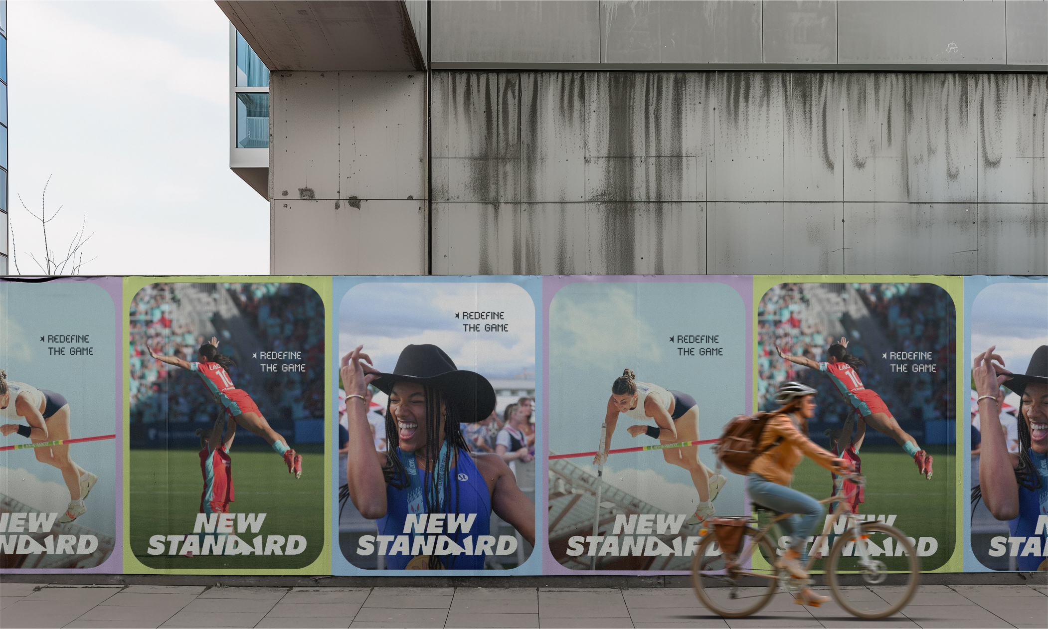
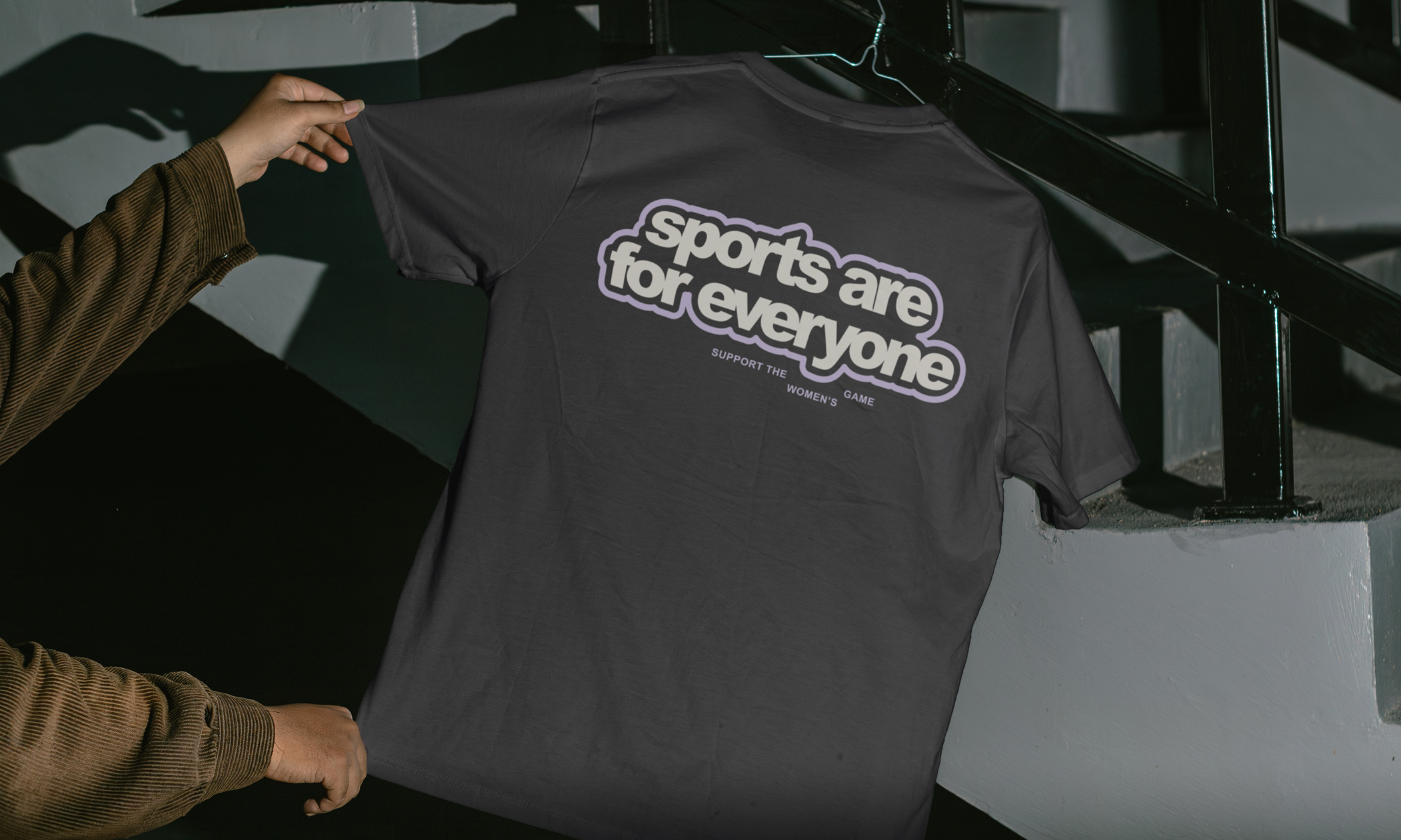
Branding for New Standard, an urban fashion brand dedicated to empowering women and championing gender equality in sports.
The project aimed to create a brand identity that seamlessly blends stylish urban fashion with a powerful message of inclusivity and empowerment in athletics.
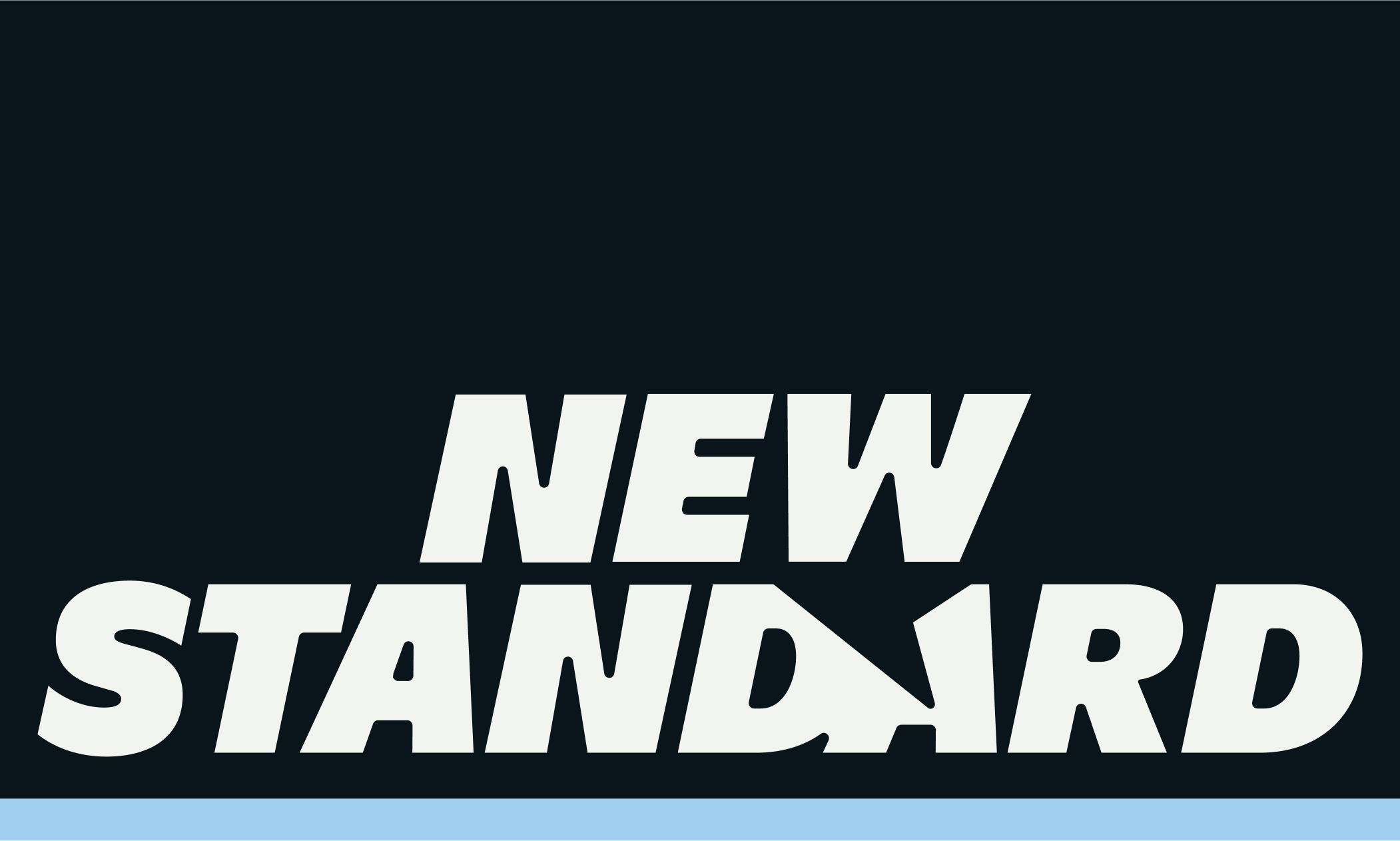
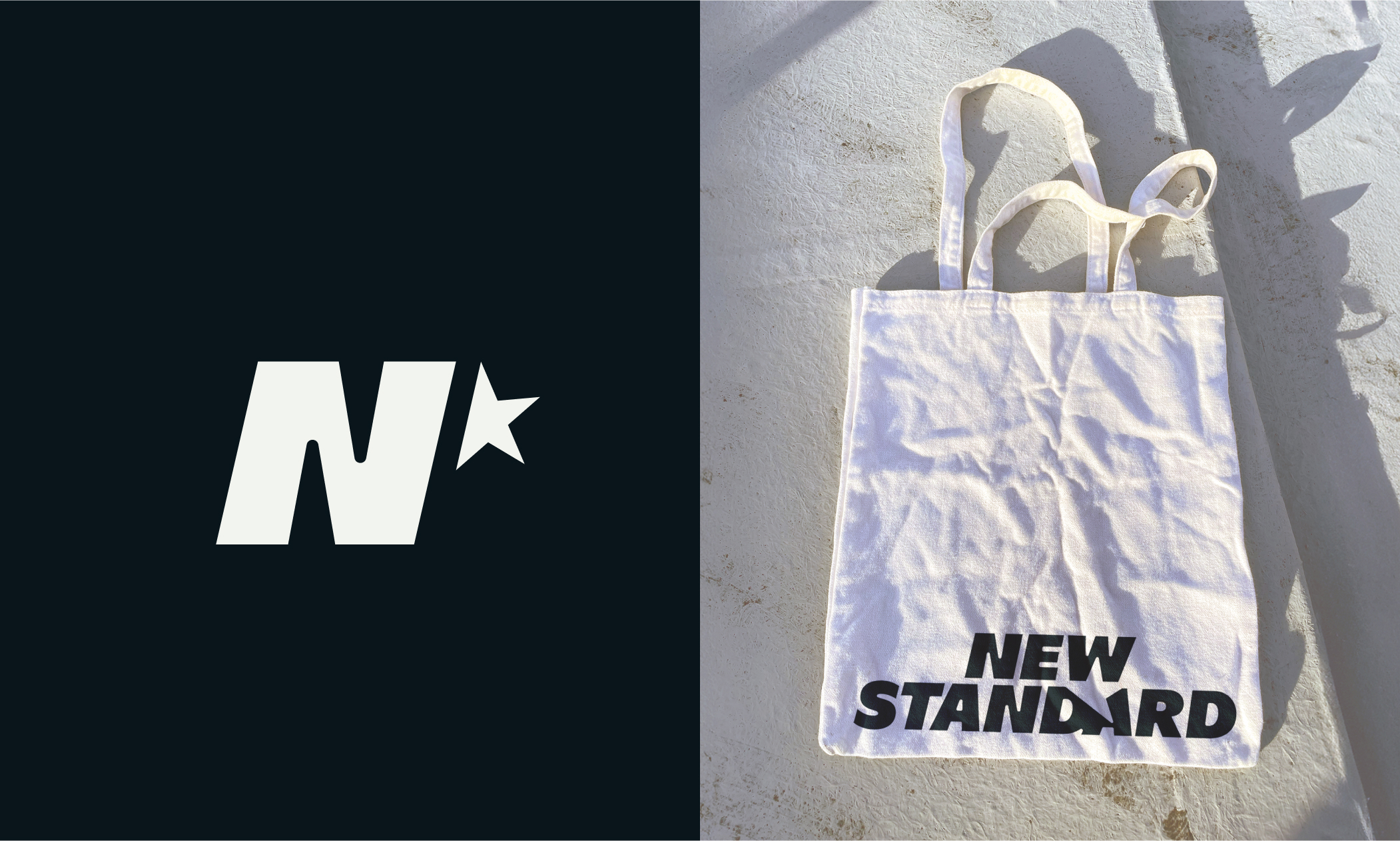
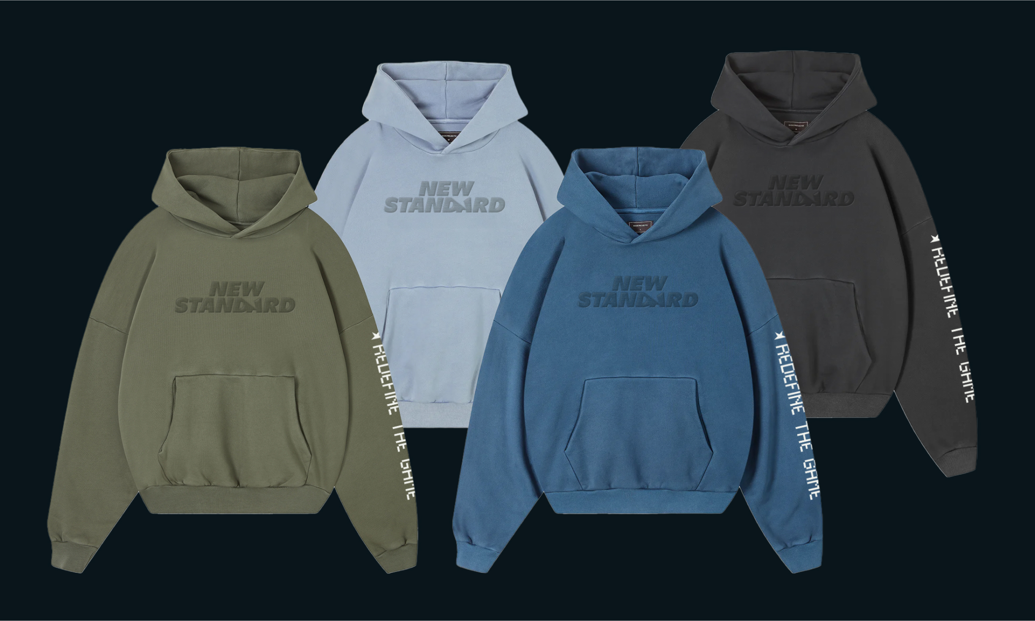
The logo features an unfinished star symbol, representing the ongoing journey towards gender equality in sports. The brand's color palette reinterprets traditionally masculine hues, using lighter shades to convey optimism and inclusivity. Typography choices, inspired by sports timers, emphasize the urgency of the brand's mission.
Interbloom
Info
Interbloom
Naming, Creative Direction, Brand Strategy, Visual Identity, Copywriting
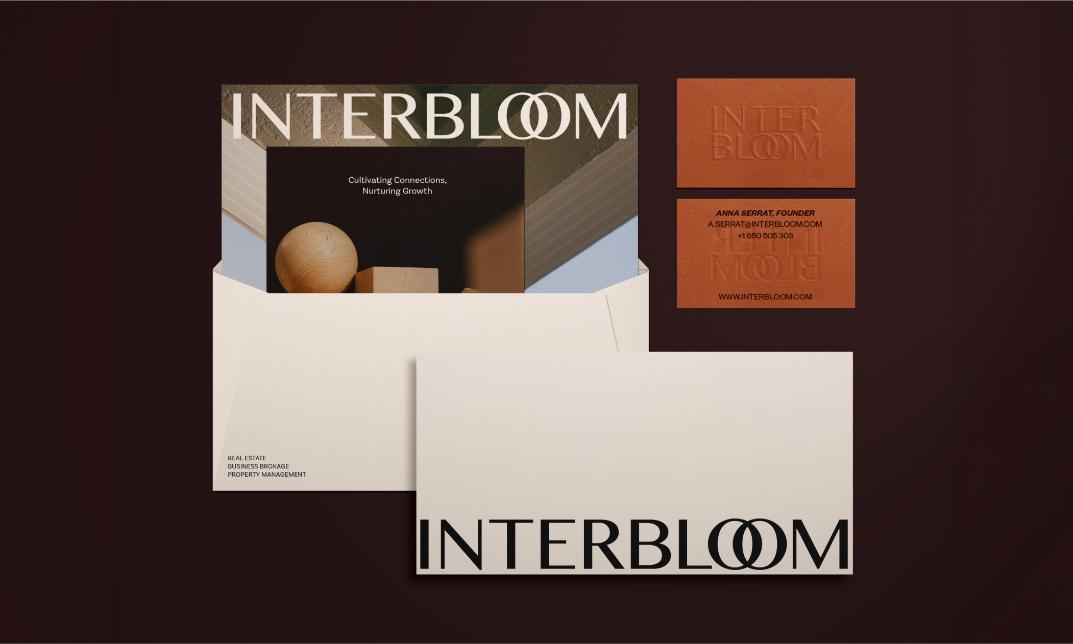
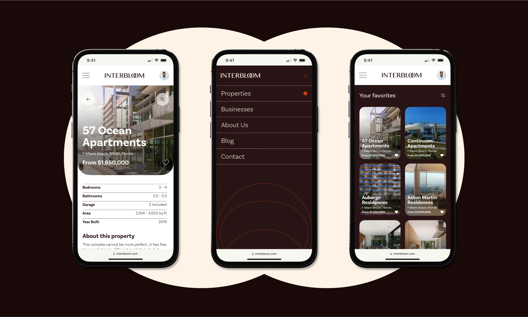
A visual identity for a real estate and business brokerage group based in South Florida. Interbloom provides services and business brokerage that aim to go beyond transactions, creating lasting value through strategic partnerships. They cultivate a collaborative and supportive network. The strategic approach to the project was to represent the founders belief that individuals and businesses can connect, share knowledge and support each other.
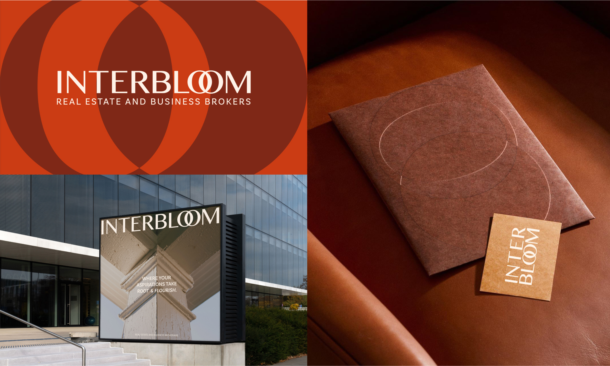
The two ‘o’s within the Interbloom name represented an opportunity to visually depict the merging of these values. Interbloom embraces modern design sensibilities, by applying visual tones appropriate to the market, yet diverging from competitors. Its color palette evokes associations of quality, security, warmth, and comfort, resonating with people's perceptions.